 English
 简体中文
 Русский
 Español
 Deutsch
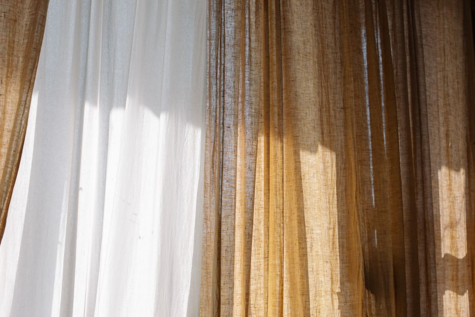
Why Curtain Fabric Color Matters More Than You Think
Curtains are one of the largest textile investments in any room. A standard living room window can require six to ten yards of fabric, which means your color choice will dominate the visual field long before anyone notices the furniture, artwork, or flooring. Color influences perceived room size, ceiling height, warmth, and even mood. According to color psychology research, warm hues such as terracotta and amber can raise perceived temperature by several degrees, while cool blues and grays create a calming, spacious effect. Choosing the right curtain fabric color is therefore not a decorative afterthought — it is a foundational design decision.
This guide walks you through light conditions, room function, undertones, pattern scale, hardware coordination, and practical testing methods so you can select a curtain color you will still love in ten years.
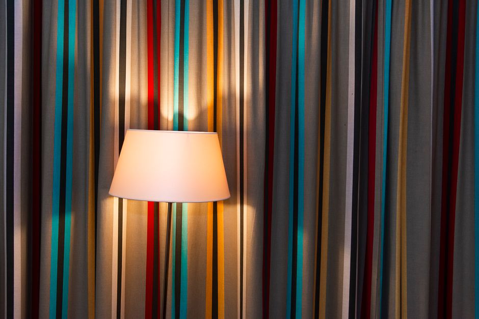
Start With the Room's Function and Mood
Every room asks a different question of its curtains. A bedroom needs colors that support rest; a home office needs colors that sustain focus; a dining room benefits from appetite-friendly warmth.
Bedroom: Calm and Cocooning
Soft, muted tones work best: dusty rose, sage, oatmeal, slate blue, and warm charcoal. These colors recede at night and reduce visual noise. Avoid high-saturation reds and oranges unless you deliberately want an energizing effect. If you use blackout lining, remember that the lining color also matters — ivory lining brightens the face fabric, while gray lining deepens it.
Living Room: Balanced and Adaptable
The living room is a multi-purpose space, so mid-tone neutrals and gentle colors offer the most flexibility: greige, mushroom, soft olive, denim blue, and warm taupe. These shades bridge both daylight and evening lighting and tolerate changing decor.
Kitchen and Dining: Fresh and Warm
Kitchens often benefit from lighter, washable colors such as cream, pale yellow, soft green, or light blue. Dining rooms can carry deeper, richer tones like burgundy, forest green, or navy because meals are often enjoyed in lower light.
Home Office: Focused and Neutral
Blue and green families are linked to concentration and lower stress. Choose medium-depth tones such as teal, slate, or moss so the window does not become a distraction during video calls. Avoid busy, high-contrast patterns directly behind your desk.
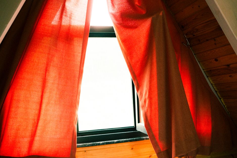
Assess Natural Light Before You Fall in Love With a Swatch
Light is the single biggest variable in how curtain fabric color reads in a room. The same fabric can look entirely different on a north-facing wall than on a south-facing one.
- North-facing windows: Receive cool, indirect light. Warm up the room with beige, blush, gold, or soft coral. Cool grays and blues can turn icy here.
- South-facing windows: Flooded with warm, direct light. Cool colors such as blue, green, and gray balance the glare beautifully. Very warm colors may feel overly hot in summer.
- East-facing windows: Bright morning light with cooler afternoons. Greens, aquas, and soft yellows work well.
- West-facing windows: Intense, warm late-afternoon light. Cool neutrals and muted blues prevent the room from feeling overheated at sunset.
Also consider the season. A color that feels cozy in December may feel heavy in July. If you want year-round balance, choose mid-tone neutrals with a subtle undertone rather than extreme darks or brights.
Understand Undertones and Color Temperature
Undertones are the subtle colors beneath the surface color, and they determine whether a curtain harmonizes or clashes with your walls.
| Undertone | Typical Colors | Best Paired With |
|---|---|---|
| Warm | Cream, camel, terracotta, olive, gold | Warm wood floors, brick, brass hardware |
| Cool | Gray, blue, silver, plum, emerald | Cool marble, chrome, black metal, white trim |
| Neutral | Greige, taupe, mushroom, oatmeal | Almost anything; excellent for open-plan homes |
A quick test: hold the fabric swatch next to your wall paint in daylight. If the wall suddenly looks yellow or green, the undertones conflict. If the wall looks richer and more balanced, you have found a match.
Use Color to Change Perceived Room Size
Color can visually expand or contract a space.
- Make a small room feel larger: Choose curtain colors close to the wall color. This creates a seamless, continuous plane and pushes the walls outward visually.
- Make a large room feel cozier: Use deeper, contrasting curtain colors to draw the walls inward and create intimacy.
- Raise the ceiling: Hang curtains high and choose a color similar to the ceiling or trim so the eye travels upward without interruption.
- Widen a narrow room: Extend the rod beyond the window frame and use a color that matches the wall, so the fabric appears to be part of the architecture.
Coordinate With Existing Furniture and Flooring
Curtains should relate to the room, not compete with it. Follow the 60-30-10 rule: 60 percent dominant color (walls and large furniture), 30 percent secondary color (upholstery, rugs), and 10 percent accent (curtains, pillows, art).
If your sofa is a bold pattern, let the curtains be a solid pulled from that pattern. If your furniture is neutral, curtains can carry the color story. Always pull at least one curtain color from an existing element — a rug, a painting, or a throw pillow — so the room feels intentional rather than assembled.
Wood Tones Matter
Warm oak and walnut floors pair naturally with warm curtain colors: camel, rust, olive, cream. Cool gray and whitewashed floors pair better with cool tones: slate, navy, silver-gray, icy blue. Mixing warm floors with cool curtains can work, but it requires a bridge color such as greige or a patterned fabric containing both temperatures.
Consider Pattern, Texture, and Scale
Color does not exist in isolation. Pattern affects how intense a color appears.
- Small-scale patterns read as texture from a distance and soften strong colors.
- Large-scale patterns make a bold statement and should be balanced with solid colors elsewhere.
- Textured solids — linen, velvet, boucle — add depth without visual noise and are the safest long-term choice.
- Sheer layers in white or ivory diffuse light and make any color behind them feel lighter.
If you love a bold color but fear commitment, use it as a trim, leading edge, or lining rather than the full panel.
Match Hardware and Trim
Curtain rods, rings, and tiebacks act as jewelry for your fabric. Brass and gold warm up cool colors; matte black and chrome sharpen warm ones. If your curtain color is already warm, a cool metal adds contrast and prevents the scheme from feeling flat.
Test Before You Buy: A Practical Checklist
- Order large swatches — at least 12 by 12 inches — not tiny chips.
- View them at three times of day: morning, afternoon, and evening with lamps on.
- Tape swatches at the actual window height, not on a table.
- Check them against wall paint, flooring, and your largest piece of furniture.
- Step back ten feet and squint. The color that still reads well from a distance is the winner.
- Ask for a fabric sample in the exact dye lot you will receive; dye lots vary.
Common Mistakes to Avoid
- Choosing color from a screen. Monitors distort hue and saturation.
- Ignoring the lining. Linings change face color and fade resistance.
- Buying the trendiest color. Trends cycle; neutrals endure.
- Forgetting fade resistance. South-facing windows need solution-dyed or UV-treated fabrics.
- Over-matching. Perfectly matched curtains and walls can look flat; a slight tonal shift adds depth.
Final Thoughts
The right curtain fabric color is the one that answers the needs of the room, respects the light, and harmonizes with what you already own. Start with function, filter by light and undertone, test with real swatches, and choose a shade you can live with through every season. When in doubt, a textured mid-tone neutral with a well-chosen lining is the most forgiving and elegant choice you can make.